Pepsi — a cinematic blue revolution for the web
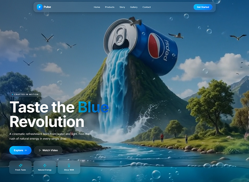
A concept landing page that reimagines how an iconic beverage brand could feel online — a bold, immersive experience built around cinematic product storytelling, dynamic motion, and a confident blue visual language designed to make every visit feel like a refreshment.
The brief, at a glance
- Client
- Personal Concept Project
- Industry
- FMCG · Beverage Brand Experience
- Timeline
- 5 weeks
- Year
- 2025
Scope of Work
Concept, art direction, UI/UX design, interaction design, and AI-assisted creative workflow for a single cinematic landing experience — an independent exploration, not a redesign of the brand identity.
Services Provided
Project Goals
- Design a visually striking product landing page that commands attention from the first frame.
- Showcase the product through immersive, cinematic storytelling.
- Build a conversion-focused marketing experience with a clear action path.
- Balance bold, dynamic visuals with strong readability and usability.
- Deliver a fast, responsive, and engaging interface across every device.
The problem we set out to solve
Bold without breaking the flow
Bold visuals and motion are powerful — but in a beverage context they can easily overwhelm. The challenge was to create a premium, cinematic experience that felt alive and energetic without sacrificing readability, a clean user flow, or performance. The product had to stay the focal point, the interface had to stay intuitive, and the page had to stay fast despite rich imagery and scroll-driven motion.
- Create a premium experience that energises without overwhelming the user.
- Maintain strong readability over rich, high-contrast visuals.
- Keep the product as the visual focal point throughout the scroll.
- Balance animation and motion with website performance.
- Preserve a clean user flow despite a highly dynamic, immersive interface.
Design thinking, creative direction, UX
Visual Direction
A confident Pepsi-inspired blue palette, bold contrast, and dynamic gradients set the tone. Editorial typography and large-scale product photography make the brand feel cinematic and contemporary.
Interaction Design
Scroll-based animations and subtle motion effects guide the eye down the page without distracting from the product. Every transition supports the narrative and keeps the flow clean and intuitive.
AI-assisted Workflow
AI powered the concept exploration phase — generating creative directions, hero concepts, and layout variations. Every visual decision was then refined manually for consistency, accessibility, and production-level quality.
“AI accelerates the creative process — it does not own the outcome. Boldness comes from direction; polish comes from the decisions a human refuses to compromise on.”
From research to production
Market Research
Studied premium FMCG and beverage websites to identify the patterns that signal energy, refreshment, and modernity — and the ones that bury the product under decoration.
Hero Exploration
Explored multiple hero concepts and visual directions, testing how far the cinematic energy could go before readability and product focus started to suffer.
Visual Direction
Defined a modern direction: a confident blue palette, bold contrast, dynamic gradients, and premium editorial typography built around large product photography.
Wireframing
Built wireframes focused on content hierarchy and conversion — hero, product story, social proof, and call to action mapped to a single, clean scroll narrative.
High-Fidelity Design
Designed the full interface in Figma: rounded UI elements, a clean grid system, generous spacing, and a clear typographic scale that keeps every section legible.
Polish & Performance
Refined typography, spacing, and interaction details, then optimised responsive layouts and performance so the experience stays smooth across every breakpoint.
Tools & Technologies
What we shipped
Main Features
A cinematic hero section that makes the product the centrepiece of a bold visual moment.
Large-scale product imagery framed with editorial composition and dynamic gradients.
Editorial typography with a clear, confident hierarchy and premium spacing.
Smooth scroll-based animations and subtle motion that support the narrative.
A clear call-to-action hierarchy that drives conversion without clutter.
A consistent spacing system and minimal yet impactful interface design.
Design Highlights
A confident blue visual language that feels bold, fresh, and unmistakably on-brand.
Cinematic motion that energises the page without competing with the product.
Strong typographic hierarchy keeps the story clear despite dynamic visuals.
A fully responsive build that stays fast, smooth, and engaging on every device.
The work, in frames


The impact
Lighthouse Score
Hero Load
Animation
Breakpoints
Achievements
A cinematic concept landing page that reinterprets a global beverage brand through modern web design.
A bold blue visual language that feels energetic and premium without overwhelming the user.
Strong visual hierarchy and a conversion-focused flow keep the journey clear from hero to action.
Accessibility and readability were prioritised across dynamic, motion-rich sections.
Performance held up despite cinematic imagery and scroll-driven motion — a portfolio piece that proves bold and fast can coexist.